top of page

Further Bank
A responsive banking website endeavor, geared towards providing unequivocal flexibility and user satisfaction.
Role
UI/UX Designer (solo)
Industry
Fintech
Duration
July - Dec. 2024
Overview
As a prerequisite for completing my UI design course, I was tasked with designing a challenger bank website. Being a new player in the fintech sector, Further Bank is aimed at piquing the interest of students, expats and young professionals with a wide array of modern digital banking services.
Project Challenge
The fundamental aim of the banking website design was to create a responsive or adaptive design layout for mobile, desktop and tablet devices, hence giving end users more flexibility and an enhanced user experience.
Moreover, part of the requirement of this project was to develop a design that respected the bank's core values: "Clear", "Playful" and "Trustworthy" while adhering to fundamental design principles.


My Process
I began the project with mood boards to establish the visual direction—focusing on the bank's brand values; Clear, Playful and Trustworthy. After aligning on the aesthetic, I developed a design system that included a cohesive color palette, accessible typography, custom icons, and friendly yet professional illustrations to reflect the brand’s values.
Furthermore, I started designing responsive layouts, ensuring consistency across desktop, tablet, and mobile platforms.


Who the user is...
Developing user personas following preliminary research and interviews was paramount in establishing a better structure and firm understanding of priority steps to take in the design process, thereby highlighting the following benefits:
Clarity in Design Decisions
User personas provided a clear reference point for every design choice, from information layout to micro-interactions. Instead of designing for a vague “user,” I designed for Melanie, a Marketing Specialist who seeks a hitch-free salary account and to better manage her personal finances.
Human-Centered Experience
By embodying actual user goals and frustrations, personas kept the design process empathetic and human-centered. I could prioritize features like instant money transfers or fast signup based on what our users truly valued.
Optimized Task Flow
Understanding different user behaviors allowed us to optimize task flows (e.g., signup and money transfers) to match user expectations and reduce friction, improving usability and engagement.
Persona #1

Persona #2

Persona #3

Task flows


Information architecture

Typography

Brand colours | Components


Layout iterations:
Through out the span of the project, I developed several screen iterations. Applying changes along the way as the design phase took form. The UI was refined to optimize usability, clarity, and visual hierarchy across the entire banking experience.
I explored the use of bold flat illustration style to accentuate a light-hearted undertone, while presenting a subtle visual storytelling across the various screens. I applied more contrast on some texts in certain areas of the layouts for better accessibility.
I felt quite happy with how juxtaposing light and dark color tones, typography, icons and illustrations all play out to make the design bold and engaging.


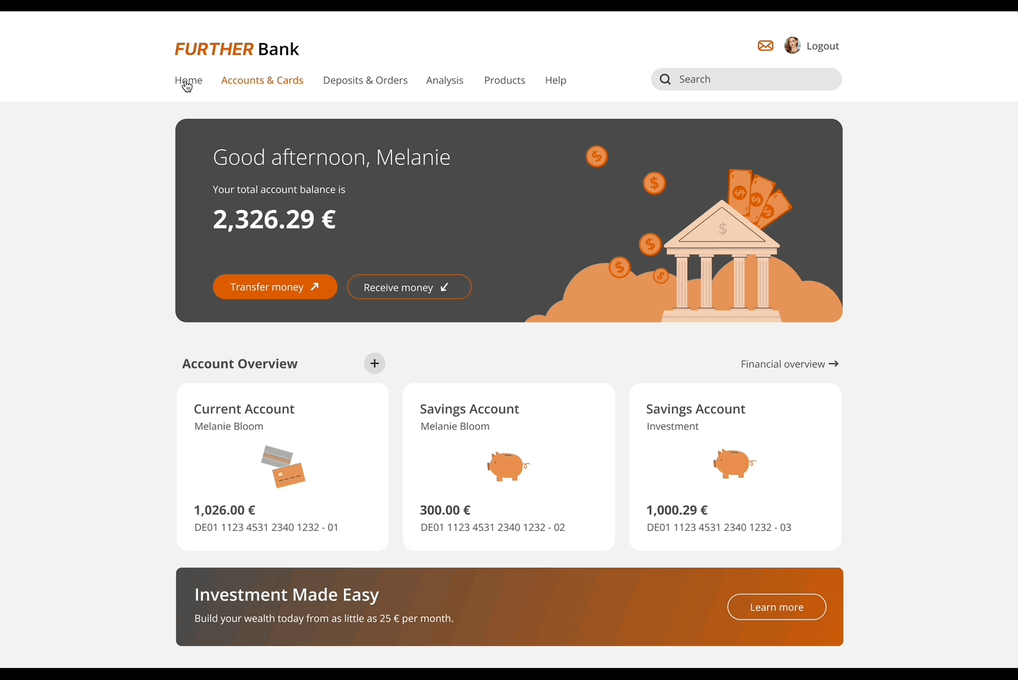
High Fidelity prototypes:
The pixel-perfect high-fidelity prototype had to accurately represent the final layout, branding, and interactions, allowing for realistic user testing and stakeholder feedback before development.


Positive outcome
The final responsive UI design was a significant improvement from early iterations which set the tone for a seamless user experience across all devices, offering an intuitive interface tailored for modern banking needs.
Applying my design system efficiently, brought impactful visual consistency, brand cohesion, and efficiency to future updates.


Final Thoughts
This project emphasized the importance of a solid design foundation and iterative feedback. Moving forward, deeper integration of user testing at earlier stages and ongoing analytics tracking will necessitate further refinements.
Exploring motion design and micro-interactions could enhance engagement, while I envisage scaling the design system for future projects.

Thank You
bottom of page